Did you know your handwriting tells of your personality? Every time you pick up a pen and begin writing your essay, report, article or letter, you are reflecting who you are just by the way you write. With an increased use of computers and tablets in the digital age, it is more common to open a word document to do all of the above, than write using a traditional pen and paper. However, the same story can be told from fonts. Whether you are shy and quiet or feisty and outgoing, there is a font to reflect each and every one of your traits.
Studies have found that fonts are classified by their unique features and overall appearance. This has enabled typographers and graphic designers to assign certain fonts to different personality traits, explaining why companies adopt certain fonts throughout their branding; each word written by the company is another reminder of what they represent. Fonts can further influence how the text is perceived. It can affect the reader’s opinion on how much they enjoy and how credible they deem the text to be. For example, Courier is suggestive of a sensible person who is very traditional in their ways where as other fonts like Georgia or Shelly suggest you have a quirky or rock chick personality. Using Comic Sans will mean you won’t be taken seriously whereas Calibri will get across that you are a fun, stylish, sociable and organised character.
So what fonts are our top fashion magazines using?
The most fashionably acclaimed magazine, Vogue, uses a Baskerville typeface. It was designed in 1757 by a man named John Baskerville and is known as the font that transcends the border between the classic and the modern. With curved edges and sharp strokes, the font resembles Vogue’s refined, elegant and polished style whilst ensuring the reader agrees with a statement by an amount of 1.5% as compared to other fonts. As the Queen of the fashion magazines, we admire their petite yet impressive choice of font that makes reading the glossy mag even more of a pleasure.
Harpers Bazaar made history in the world of fashion publishing with their reinvention of the magazine and was known as “one of the most dramatic magazine reinventions in history.” Didot, was designed in 1991, as part of the new Harper’s Bazaar revamp. “We were asked to create a typeface that works like no other” said the typographers. As a result, Harpers and the Didot font now have an established and harmonious marriage that is a blessing to our eyes. Didot is durable enough to remain fashionable no matter what trends dominate which is a testament to the timelessness of the elegant magazine.
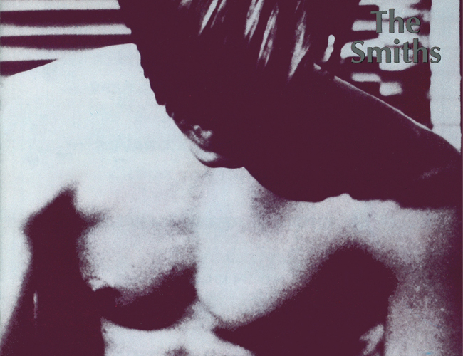
Here at MSL, we present to you our thought provoking reads using a font called optima, one that is known to be admired and adopted by many owing to its use for the Vietnam Veterans Memorial as well as the carving of the names for those lost in the 9/11 tragedy. It also has its creative uses as it featured on the original 7” album covers for music geniuses, The Smiths. The font is one that appreciates the written word and that is what we prize here every time we blog a post for you, our readers.
Marni Banks
